
B.
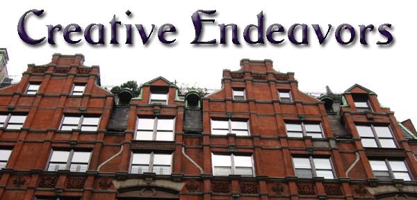
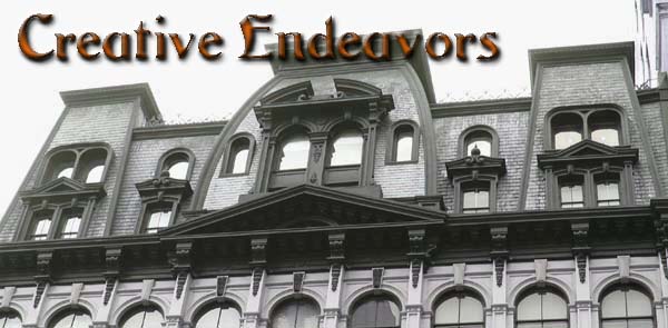
These are the headers I came up with to start this blog off. I'll probably swap out headers every few months or so, but for now, I can't choose. They'll be larger, I think, than they show here. So I decided to have folks vote. A or B? Leave your choice in the comments. Thanks.
B. I like B for sure. =)
ReplyDeleteUh, neither. For a) I don't like the way the text runs across the image, for b) I'd mirror the image so that the horizon runs a little more harmoniously; and I like the colour scheme of a) better.
ReplyDeleteWhat's your flickr screenname, btw?
Hmmmm.... I kinda agree with you on A, Catja. The original photo didn't have enough sky to work with on top. These were the best NYC building tops I had to work with.
ReplyDeleteI'm not sure what you mean by mirror the image of B. I could Photoshop it a bit more, desaturate it, but I'd intended to use photos that accurately represented my phototaking since I don't usually post Photoshopped phots.
I wonder if I should try a row of squared images.... AOL doesn't allow header images, so I didn't have this problem before. :)
Thanks for the input. My Flickr photo page is: http://www.flickr.com/photos/shellysblogger/
The link is in the sidebar, but I'll add it to the top nav bar I created.